Introduction
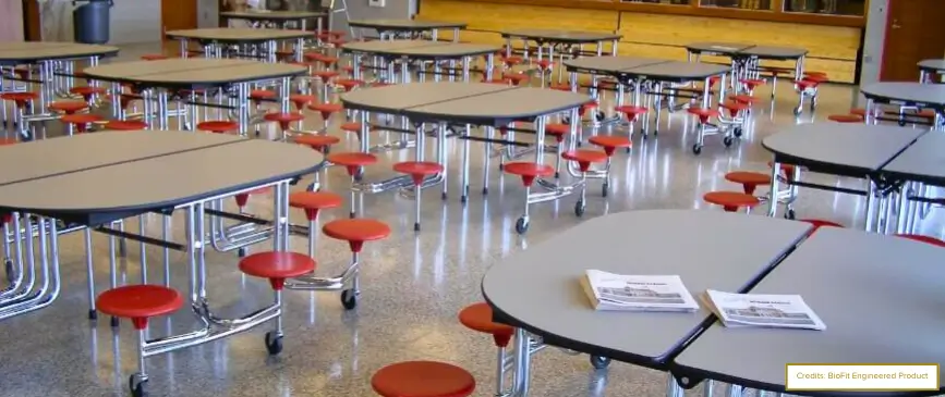
School cafeterias – the lifeline of a school, where laughter and chatter mix with the smell of good food.
But what if the space feels more like a dreary dungeon than a lively hangout?
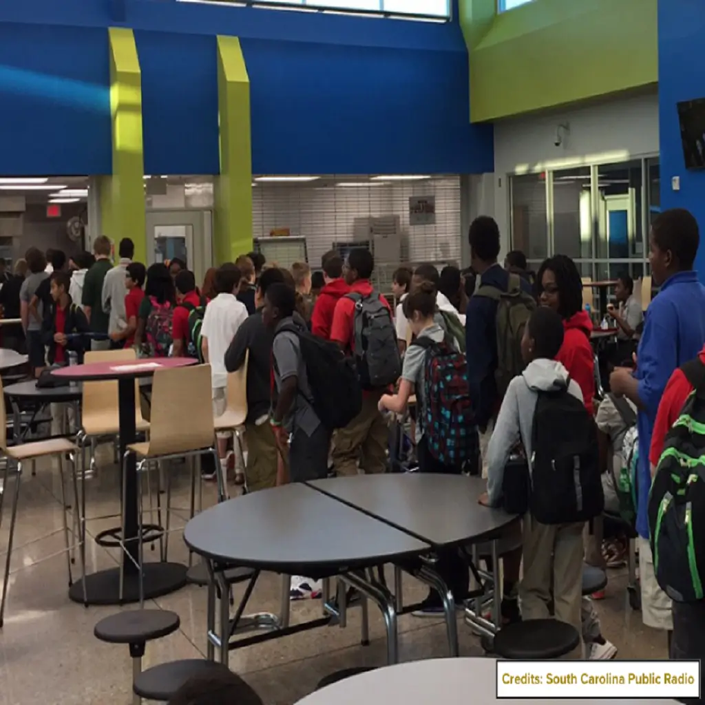
Sure, kids will make the best of it with friends and snacks, but a drab cafeteria can be a negative influence on a school’s reputation.
Today’s schools embrace modern cafeterias as versatile hubs that go far beyond serving food. And we’re at the forefront of this exciting shift! At Ingenious Culinary Concept (ICC), we’re not just aiming for eye candy; we’re all about creating lunch rooms that shine with functionality and flair.
So, why not let your school join the revolution?
Our expertise in cafeteria renovation and graphics excites us to present ideas for school cafeteria designs to transform your space from drab to fab.
Ready to see the magic? Let’s dive in!
Creative School Cafeteria Design Ideas: ICC’s Portfolio
Designing a cafeteria isn’t just about giving the space a facelift; it’s about transforming it from top to bottom.
From the walls to the floors and every table and seat in between, it’s a complete journey that takes the ordinary and turns it into something extraordinary.
We’ve gone above and beyond, and here’s a glimpse of our top 10 cafeteria design ideas brought to life by our expert Kern Halls in some of the most prestigious schools across the USA.
1. Themed Sitting Zones
We’re big believers in the magic of thematic design to get those creative juices flowing and make lunchtime a blast. Just picture stepping into a cafeteria turned into a “Space Odyssey” with shimmering stars and cosmic colors or a “Carnival Extravaganza” with vibrant stripes and fun, game-themed nooks.
These themed sitting zones don’t just spice up lunch; they make the whole experience an adventure.
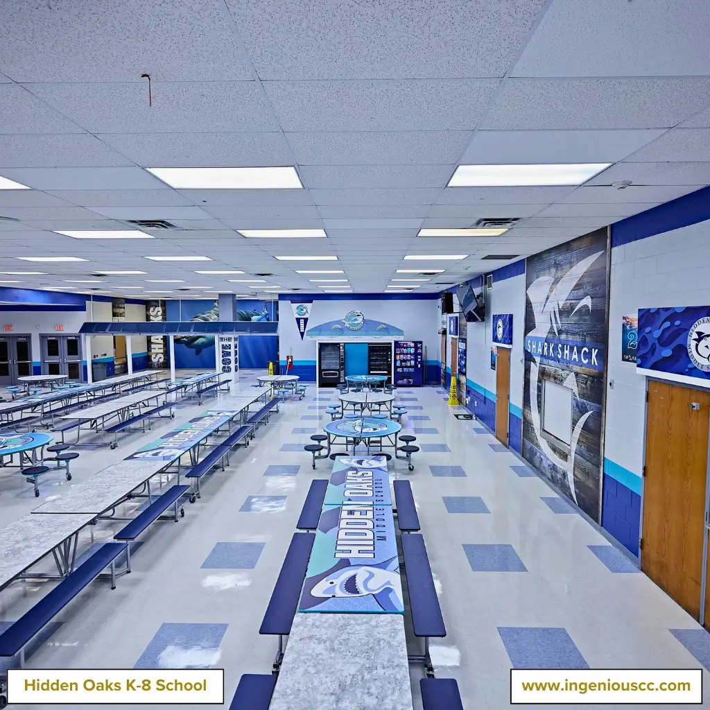
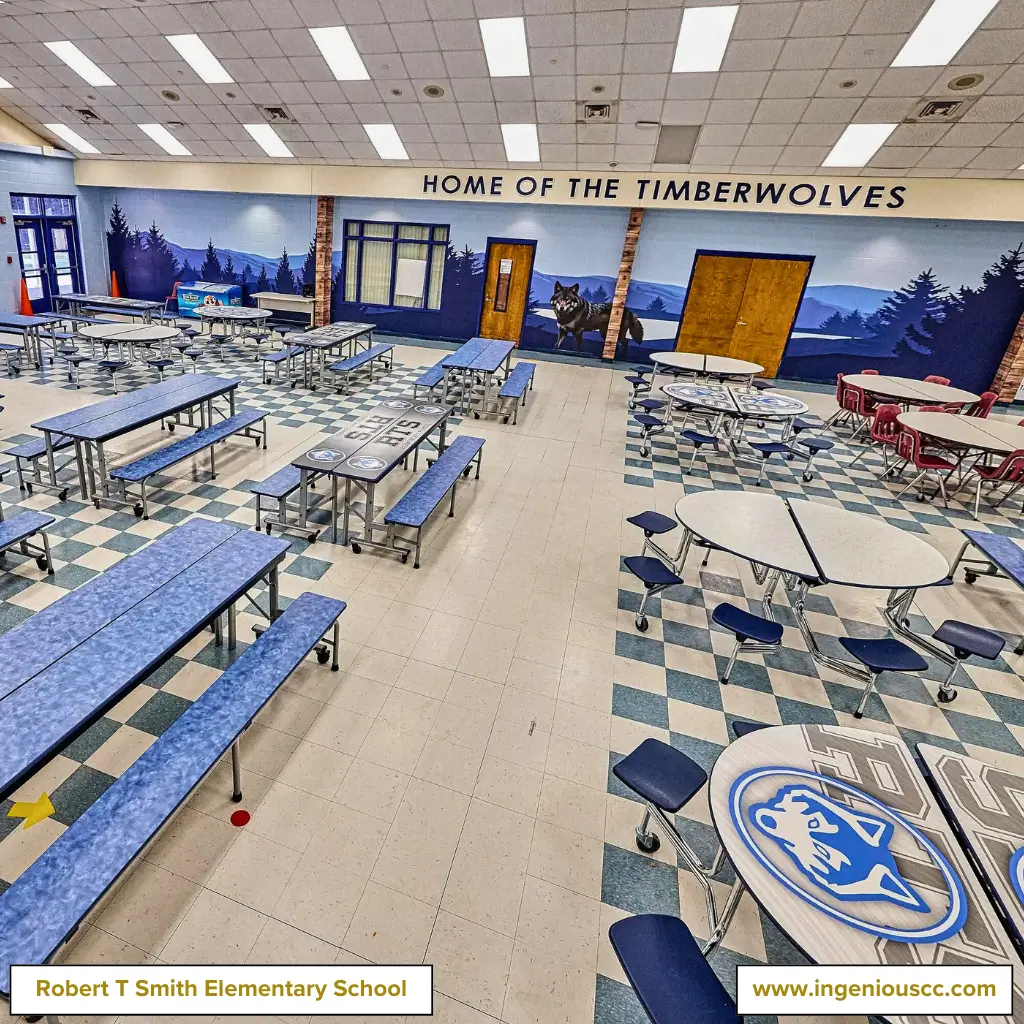
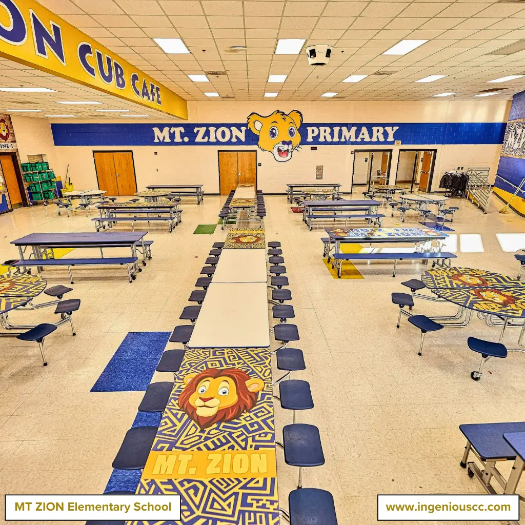
Here is a look at one of our designed shark-themed areas at Hidden Oaks, a wolf-themed zone at Robert Smith, Florida, and home cub graphics at MT Zion.
The entire area oozes the theme. Rather than just slapping on decoration, we weave the theme into every nook and cranny.
From the hand-washing stations to the entrance and exit, every corner of the cafeteria is a part of the fun.
2. Color Coding
Color coding isn’t just a splash of creativity; it’s a clever way to turn a cafeteria into something both functional and visually striking.
This can be done in many ways:
- by assigning specific colors to different dining areas
- blending dark and light tones
- setting separate colors for each zone to help students quickly navigate their surroundings
- Use contrasting colors to highlight key features like menu boards, recycling stations, or particular display areas for easy identification.
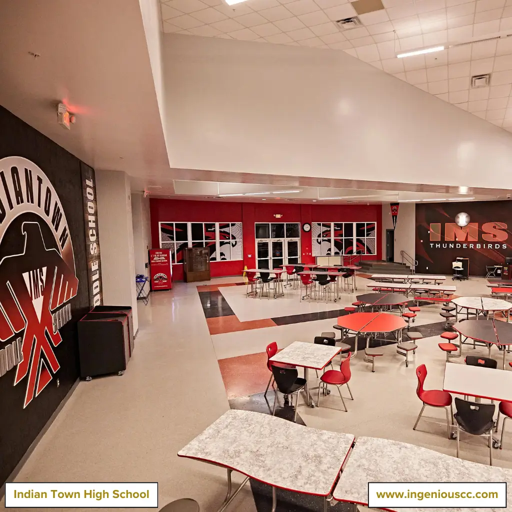
Take a peek at the snapshots of Indian Town, where we’ve applied a vibrant orange color code to energize and inspire students.
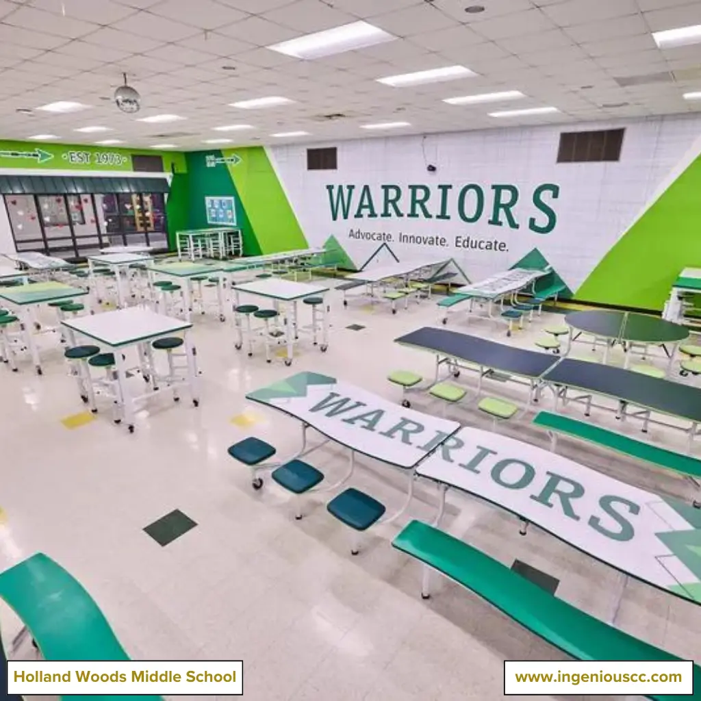
And Holland Woods with green hues to provide a calming backdrop conducive to relaxation and happiness.
By applying various shades and patterns within these color schemes, we enhance each area’s overall mood and atmosphere, contributing to a more enjoyable and engaging dining experience for students.
3. Dynamic School Spirit
We believe that a cafeteria should reflect a school’s heart and soul.
That’s why our designs are infused with elements that showcase the school’s mission and values.
From custom murals and vibrant banners to impactful signage, we incorporate symbols of school achievements to twist a narrative of pride and unity among all.
Below are images of our cafeteria designs that illustrate how we’ve brought school missions to life through thoughtful design.
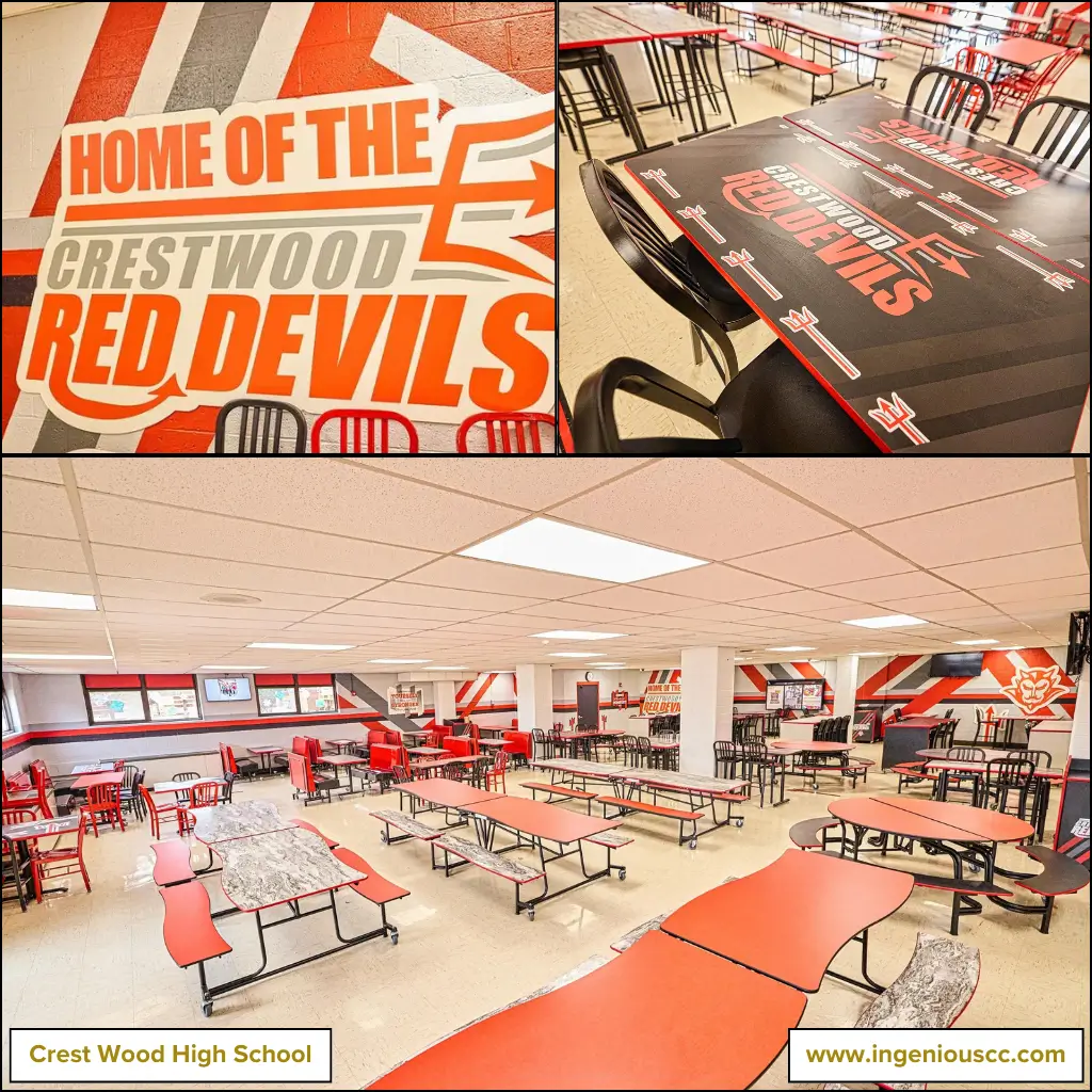
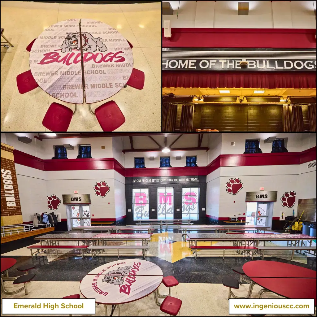
The red devil’s design is related to the school’s mascot or logo, boosting school pride and unity and inspiring students to feel confident and tackle challenges with a bold attitude. At the same time, a bulldog display conveys messages of loyalty, strength, and resilience.
4. Triple Color Harmony
Another amazing idea for a school cafeteria decoration is to use a vibrant three-color combination. This approach not only creates a visually striking space but also creates a calming and relaxing environment, which can reduce stress and anxiety.
A carefully chosen color palette can make the cafeteria feel more welcoming and livelier, encouraging students to enjoy their time.
Bright and contrasting colors can stimulate energy and even boost creativity, making the cafeteria a place where students look forward to spending their breaks.
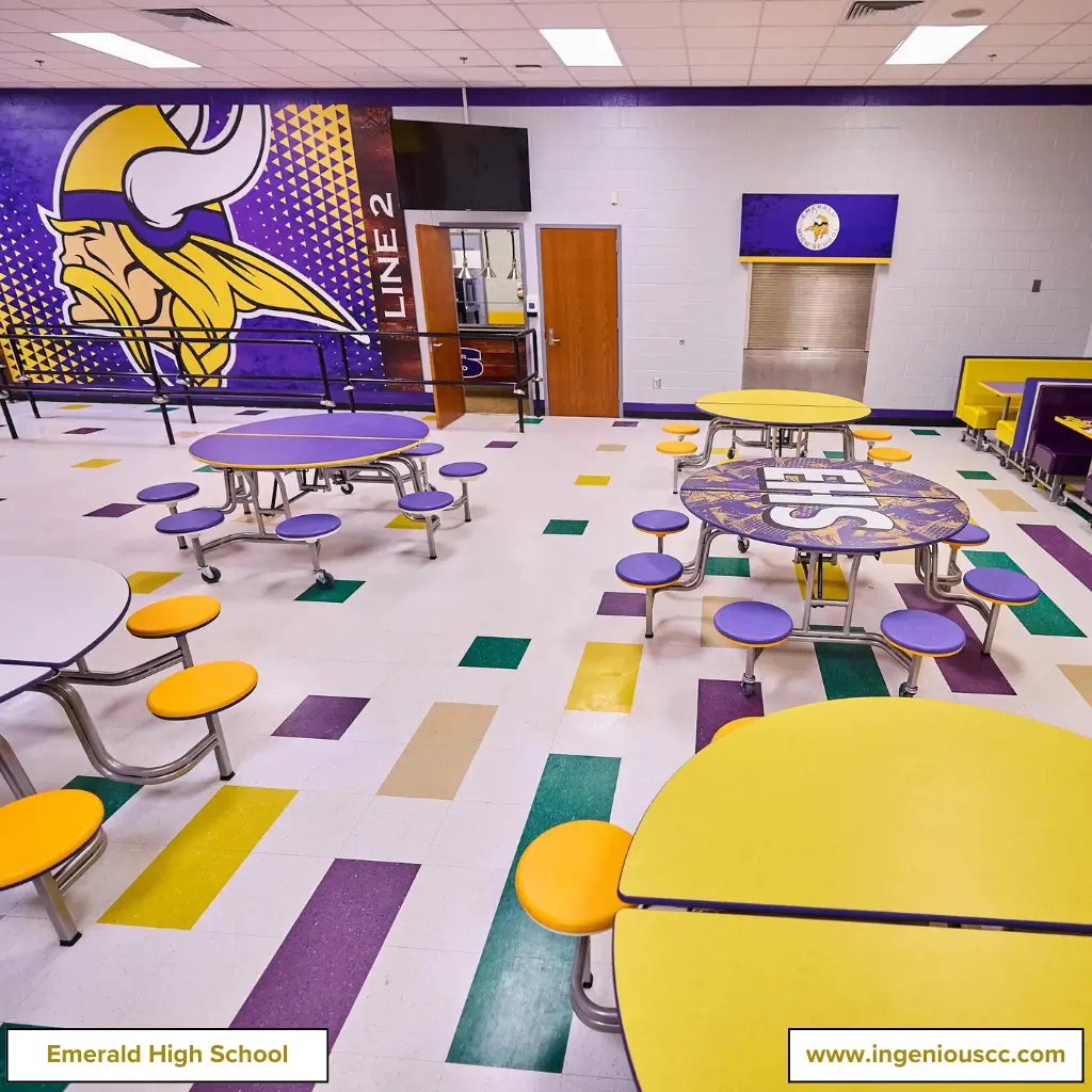
At Emerald High School, we embraced this concept by crafting a cafeteria with a bold mix of purple, yellow, and green. The colors are seamlessly integrated into the walls, furniture, and flooring, creating a cohesive and dynamic environment that students find appealing and energizing.
Here’s a look at the masterpiece.
5. Words of Wonder Wall
The Wonder Wall is one idea that’s got us really excited every time we renovate the cafeteria.
Imagine a cafeteria where inspiring quotes and motivational messages are woven into the walls or the tables and boards.
These words of wisdom are like a sprinkle of fairy dust, instantly lifting spirits and sparking productive conversations among students.
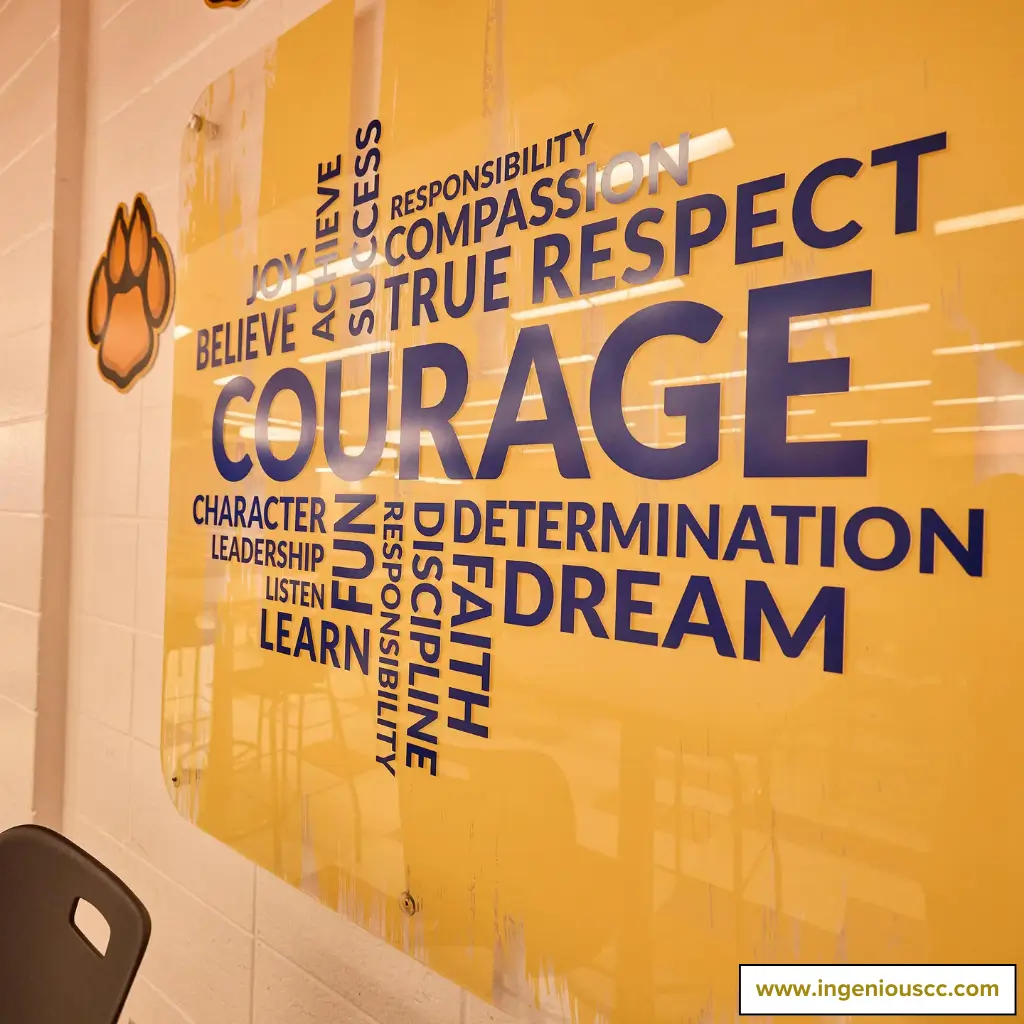
At ICC, we jazz up these quotes with fun typography and intelligent design, turning the walls into a canvas alive with energy.
It’s as if each phrase is dancing across the wall, grabbing attention and sparking imagination.
The idea is to make positivity a daily thing and create a cafeteria, an encouraging sanctuary where students are inspired to think positively and forge meaningful connections with their peers.
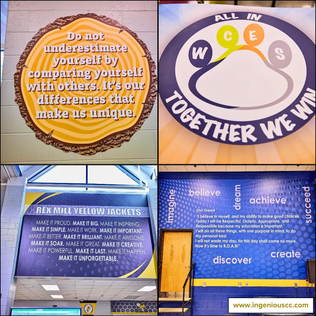
Here are more snaps from clients who’ve fallen head over heels for it.
6. Interactive Wall Displays
One standout cafeteria design idea is the interactive wall display setup.
Walls are the unsung heroes, and they can make or break a room’s vibe. Our interactive displays turn these blank canvases into dynamic hubs of inspiration and learning.
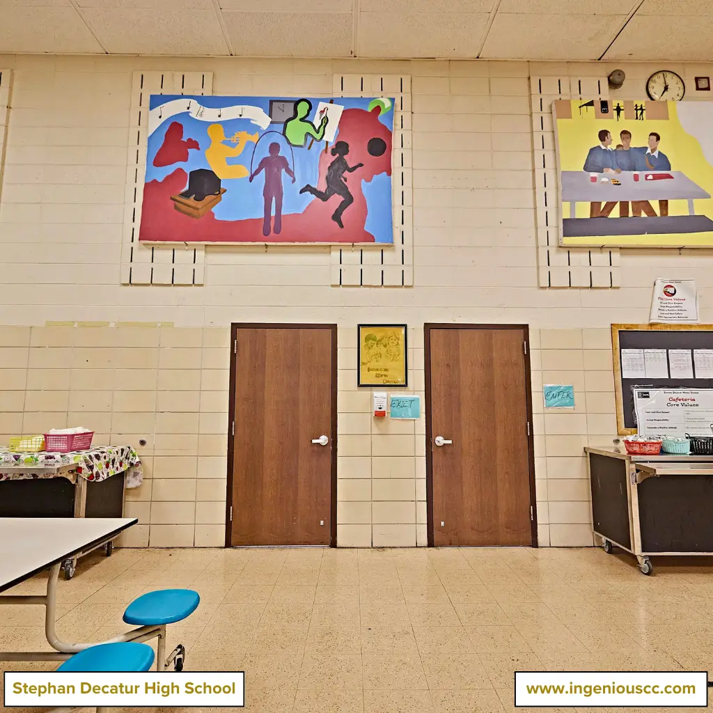
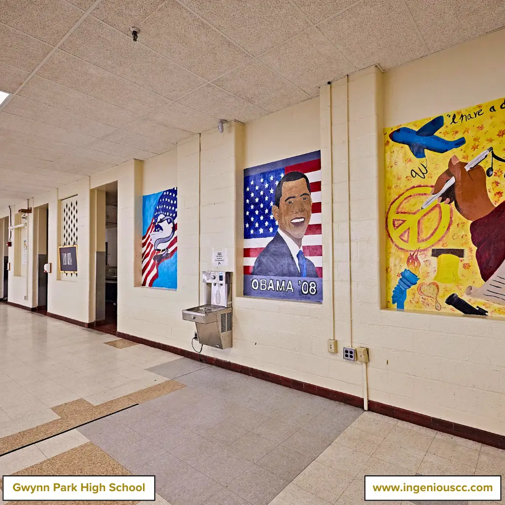
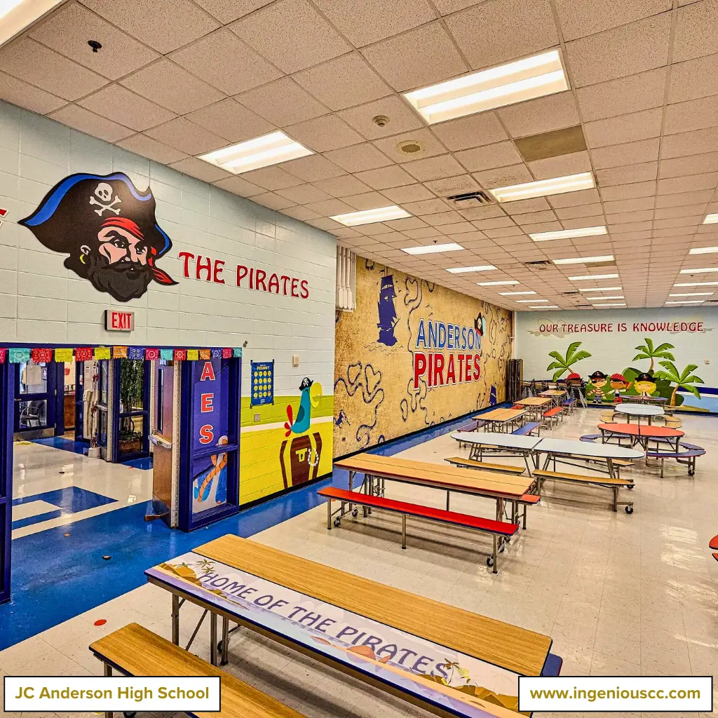
We decorate the walls of elementary schools with playful pirate adventures and vivid visuals that capture the spirit of childhood curiosity. High schools receive a more refined touch, with displays featuring vintage art, snapshots of economic trends, and stories of dreams coming to fruition.
These setups are crafted to resonate with students at every stage of their journey.
Below are more examples of our creative wall designs to help you understand how we bring these ideas to life.
Suggested Reading → Elementary Cafeteria Decoration Ideas
7. Buzz Worthy Bulletin Board
Did you know cafeteria bulletin boards are a secret weapon for schools to enhance student performance?
Apart from keeping students informed about essential details like schedules and announcements, they also help them build their personalities. They fuel creativity and collaboration, offering students a stage to share ideas and showcase their achievements.
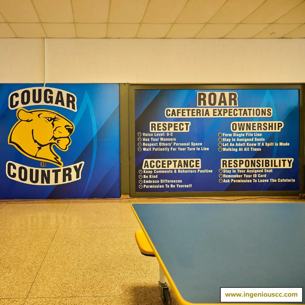
We struck gold in one of our school projects by creating a cafeteria rule board.
Not only did it jazz up the room, but it also served as a daily nudge for students to toe the line.
Further, it helped students build good habits and turned the cafeteria into a well-oiled machine, making it a welcoming and orderly environment.
If you want to see more ideas, check out our guide → How To Design a Cafeteria Bulletin Board.
8. Roof Hangings
Installing leaflets or hangings from the roof is one way to breathe life into your school cafeteria. This idea is so versatile that the sky’s the limit. You can hang anything that speaks to your school’s culture and values.
For example, colorful mobile sculptures, decorative lighting installations, or thematic decorations based on seasons or upcoming events can transform the space.
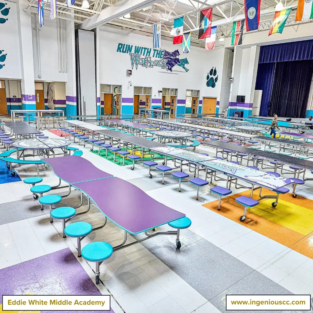
At ICC, bearing creative minds, we raised the bar by installing country flag leaflets in one of our projects.
We visually celebrate the school’s diverse community, promoting the idea that all students, regardless of race, whether black, white or any color, are united under one roof.
9. Revamping Your School Cafeteria Seating and Tables
A proper seating arrangement in your school cafeteria can significantly impact the efficiency of lunch breaks and help manage student behavior.
However, it’s more than choosing different chairs. It’s about creating a space that’s easy to manage and joy to use. Modular furniture is critical here, offering flexibility for any group size or activity.
Whether you choose assigned seating for order or a free-for-all setup for mingling, the right arrangement can make a big difference.
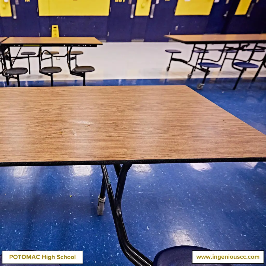
At ICC, we don’t just throw chairs around; we craft seating that fits like a glove.
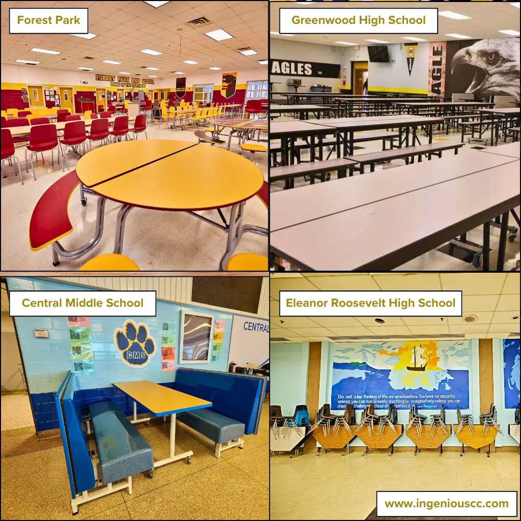
Our cafeteria seating solutions range from foldable seating for areas that require adaptability to bench tables for a more communal dining experience.
In some cases, we use a mixture of both to balance flexibility and structure, ensuring that each cafeteria meets the unique needs of its student population.
Suggested Reading → How to Choose The Right Cafeteria Seating for Your School
10. Spark Lightening
One of the best ways to add charm to a school cafeteria is by getting the lighting just right.
No matter how dazzling your bulletin boards, funky walls, or comfy seating area, dim lighting can cast a shadow over your efforts. Instead of sticking to traditional bulbs, mix them up with various lighting types.
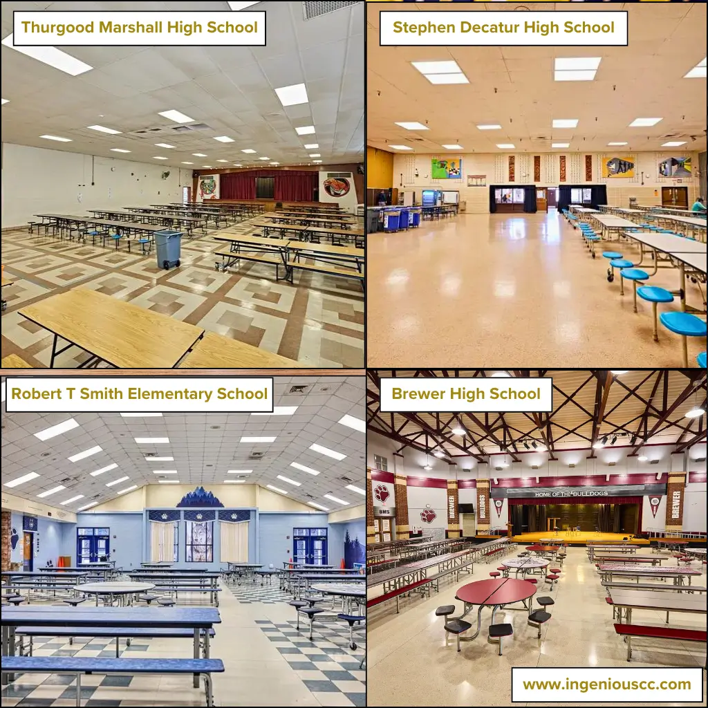
Brighten things up with pendant lights, sleek LED strips, and warm-toned recessed lights.
Below are images showcasing our standout lighting designs.
Conclusion
Impressed?
Why not take it a step further?
The cafeteria is more than just a place to eat; it’s where students gather, socialize, and recharge.
So why settle for “just okay” when you can aim for “wow”?
To hire our services or explore a more custom solution, REACH OUT TO US today. Remember, a minor upgrade can make a significant impact.
Suggested Reader → How to Design an Outstanding Cafeteria in 5 Steps
FAQs
1. How can I decorate a school cafeteria?
To decorate a school cafeteria, use vibrant colors, comfortable seating, and playful wall art. Incorporate student artwork and nature-inspired themes to make the space inviting and engaging.
2. What are some creative ways to add color to the cafeteria?
Brighten the cafeteria with colorful murals, vibrant tablecloths, and painted furniture. Adding diverse, lively colors can energize the space and make it more appealing.
3. What are some budget-friendly ways to update a cafeteria?
Refresh the look with a fresh coat of paint, repurpose existing furniture with new upholstery, and add inexpensive decorative elements like curtains or wall decals. Small changes can make a significant impact without costing too much.

